Back to work
Mobile App Case Study

LUCKY NO.1

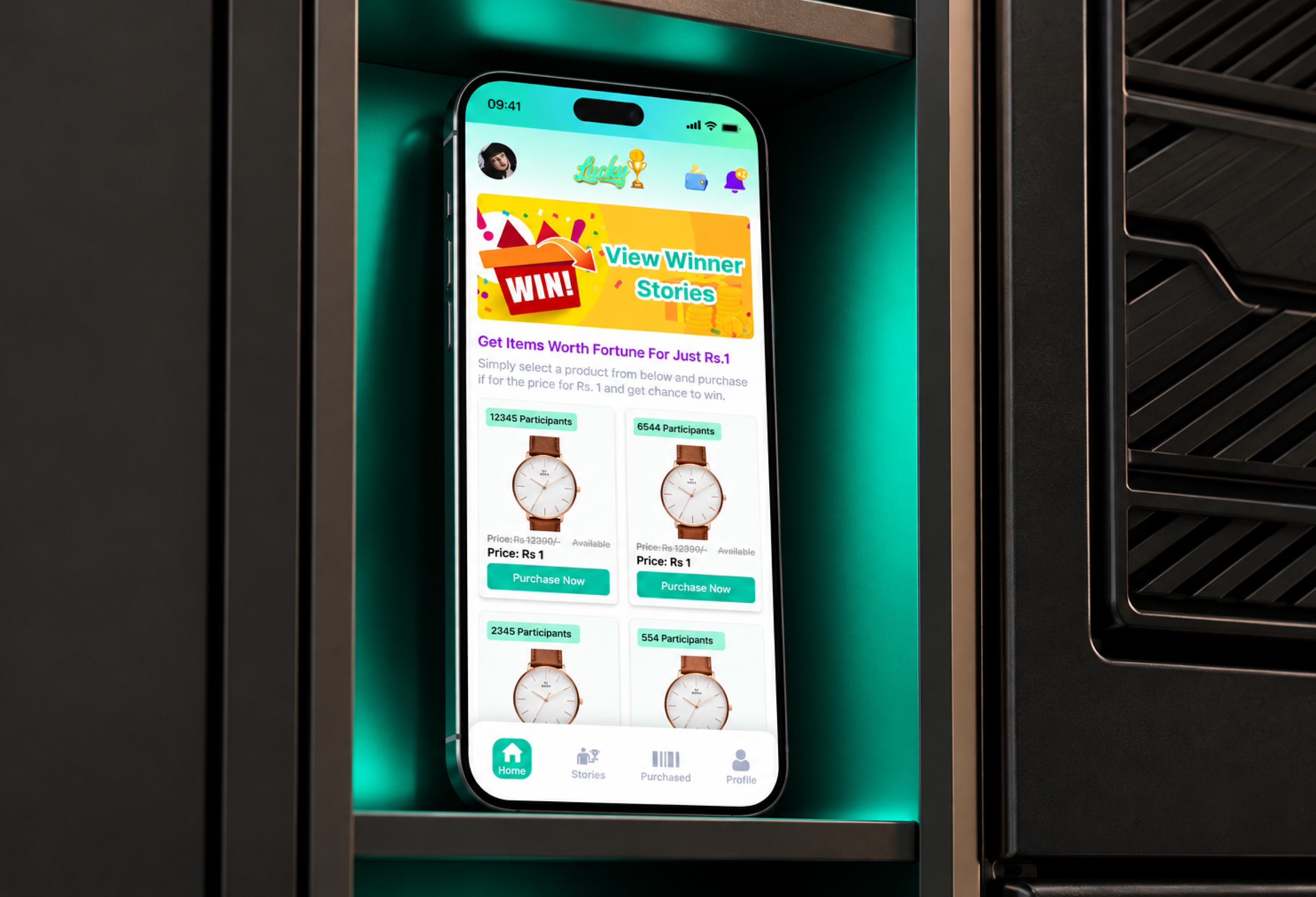
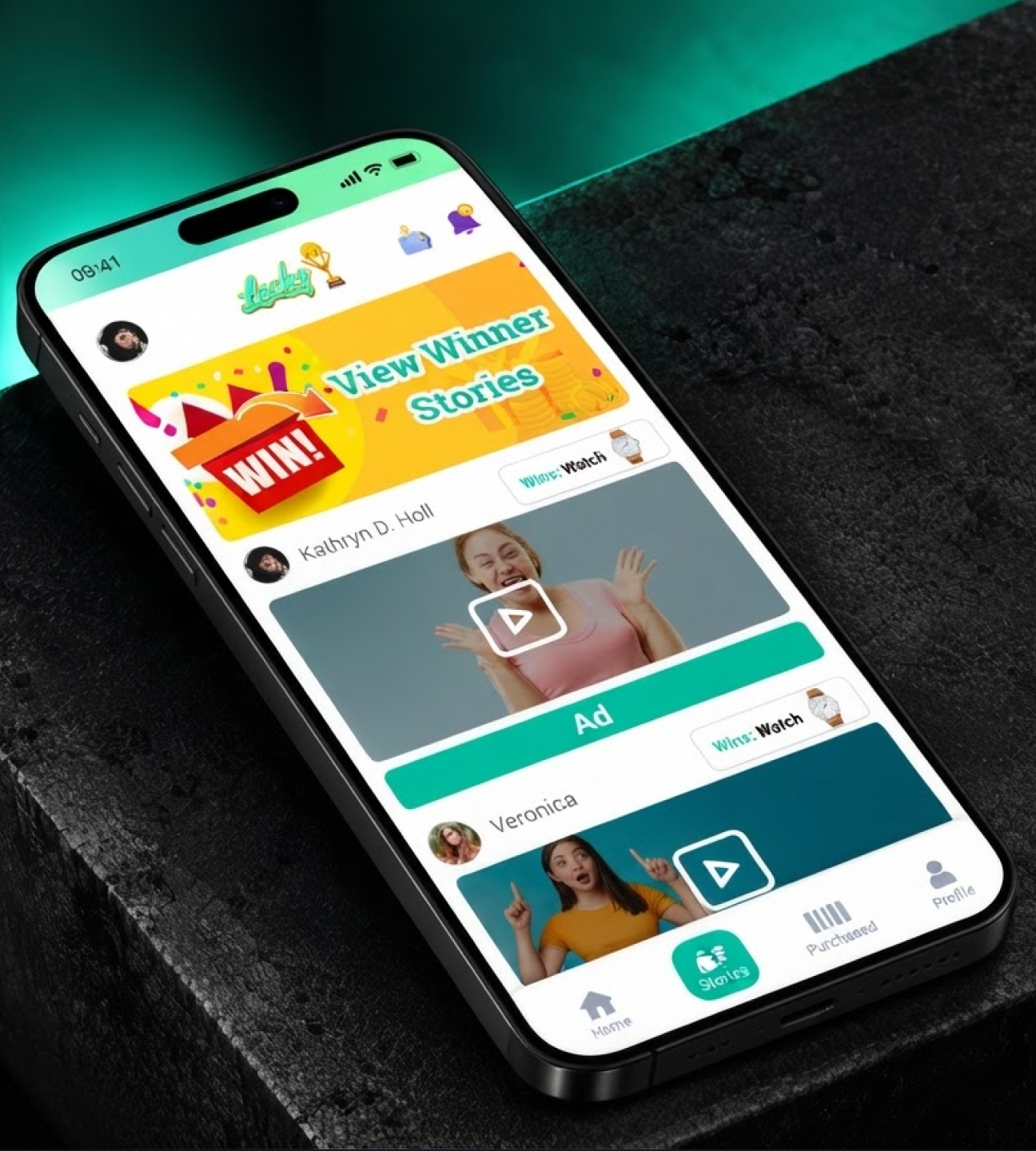
A mobile app concept focused on luck and user participation, with a clear, accessible interface and a consistent experience across screens.

IndustryMobile AppProjectMobile AppRoleMobile app UX/UI designTimeline3 weeksStatusConceptView Figma
LUCKY NO.1 hero mockup
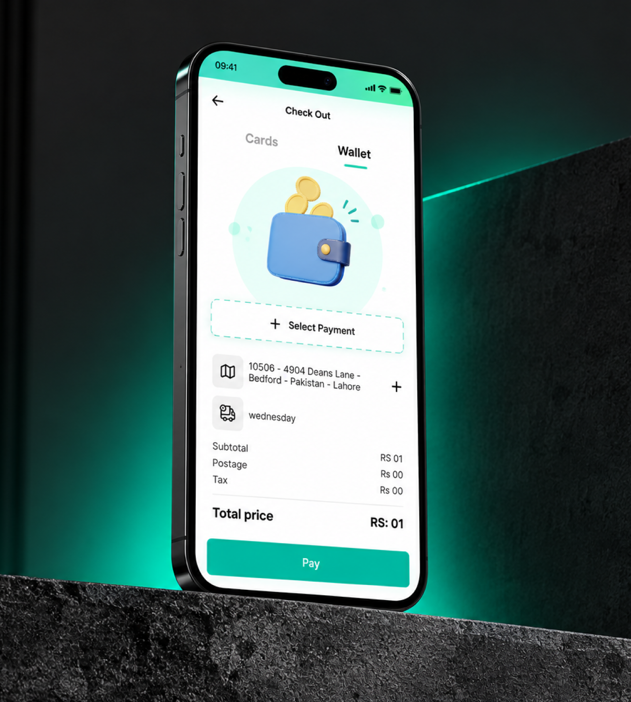
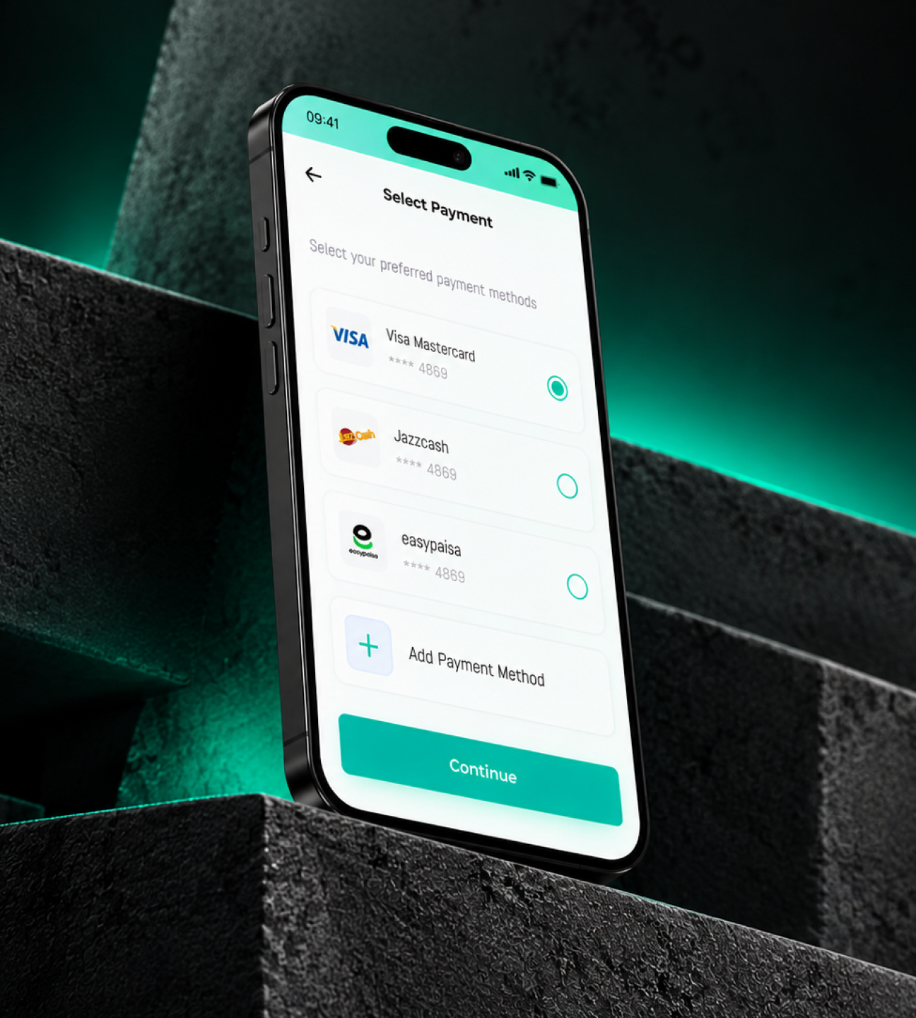
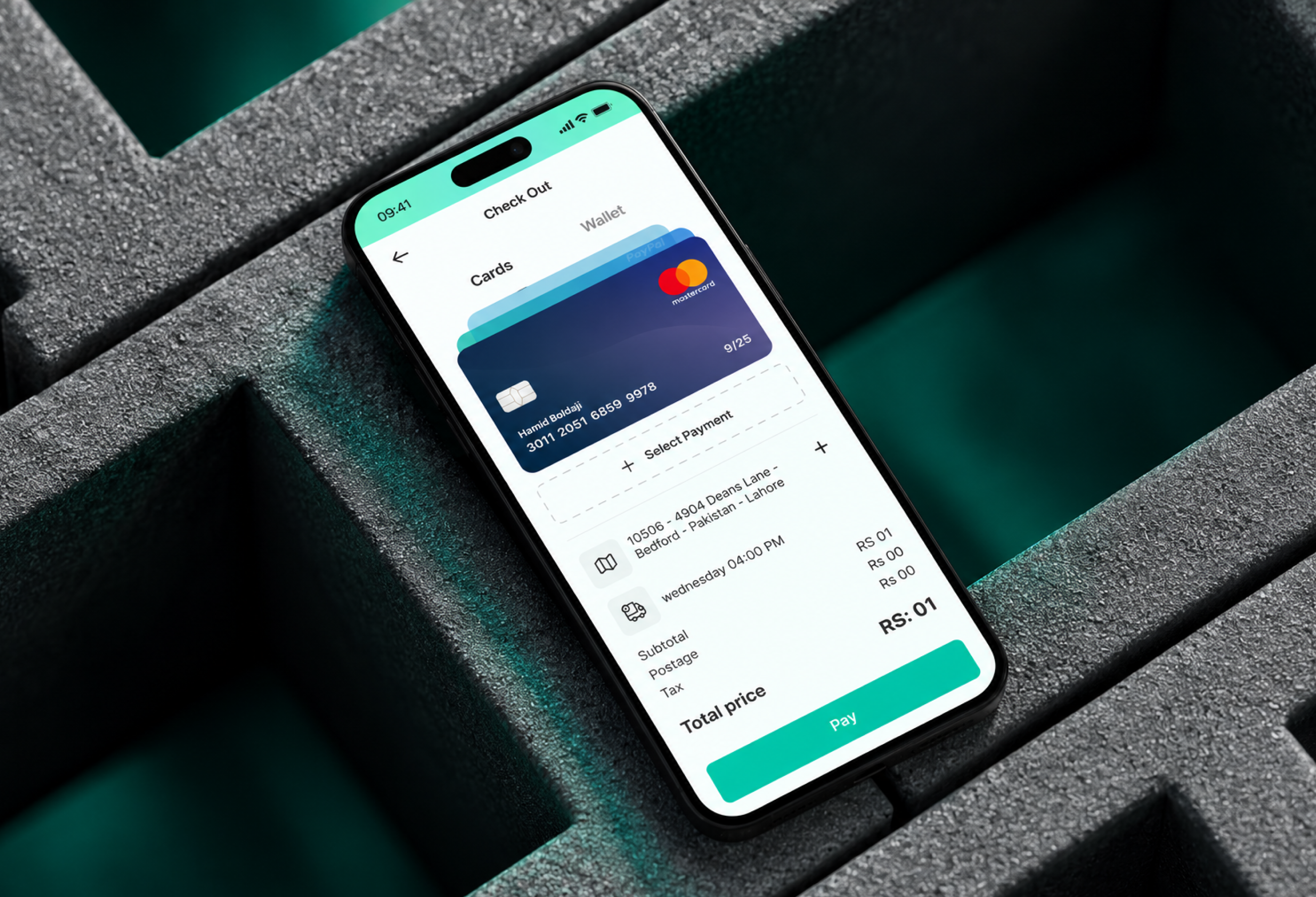
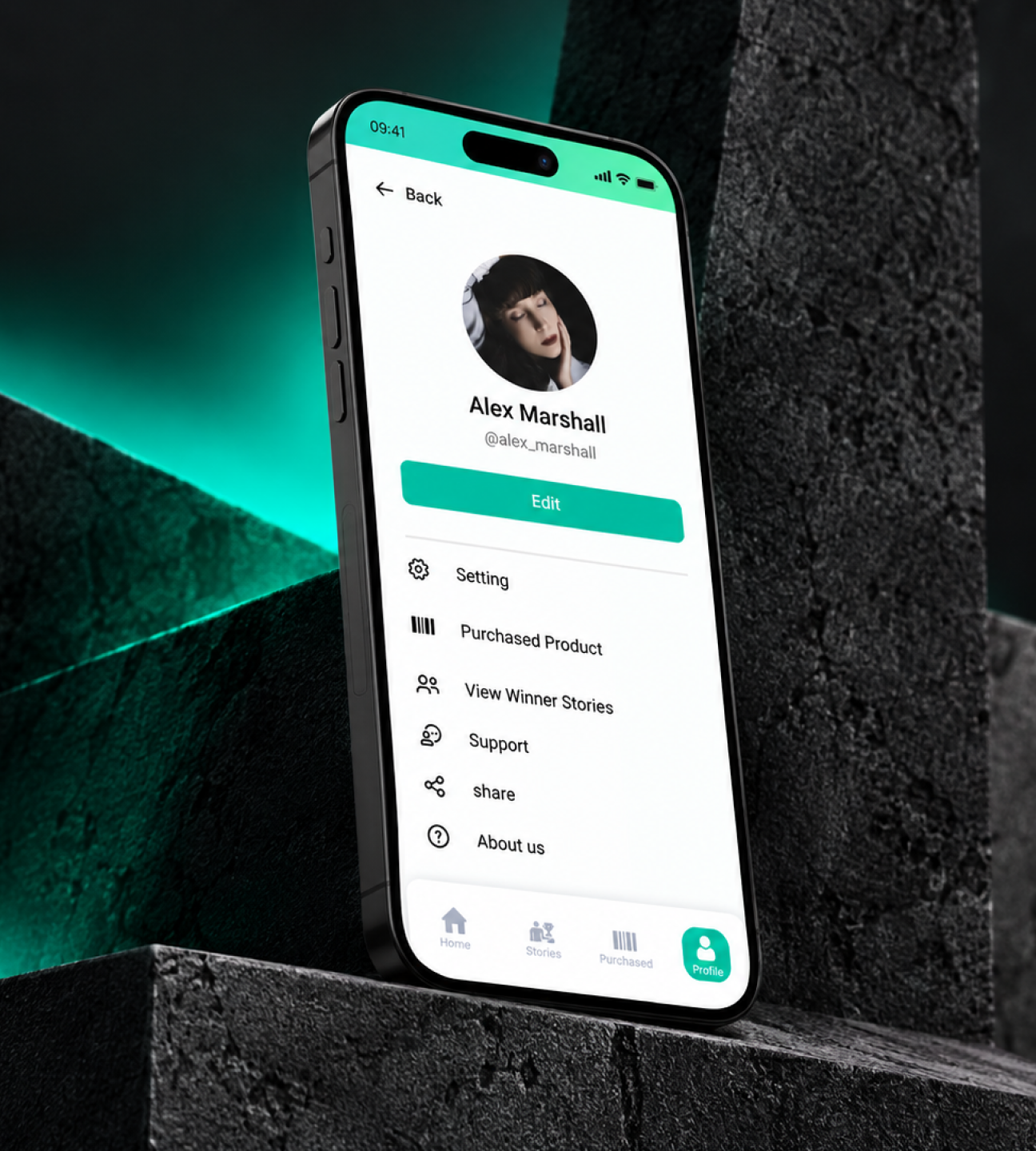
LUCKY NO.1 full preview
01

Project Overview

LUCKY NO.1 is a mobile app concept focused on delivering an engaging, easy-to-use digital experience built around luck and user participation. Its interface helps users explore the app, understand its available features, and navigate between key sections with minimal effort. The design prioritizes simplicity, accessibility, clear information hierarchy, and a consistent mobile experience.
Project Overview visual
02

Project Goals

The main goal is to create a smooth, intuitive experience that encourages users to explore the platform. The design aims for a recognizable identity, simple navigation, clear content organization, fewer unnecessary steps in common journeys, consistent components, and layouts that respond to different mobile screen sizes.
Project Goals visual
03

UI/UX Design Approach

The interface uses visual hierarchy to make important information and primary actions stand out through typography, spacing, contrast, and button placement. Buttons, cards, icons, input fields, and navigation follow consistent patterns. The mobile-first layouts prioritize touch interactions, readability, and comfortable one-handed use where possible.
UI/UX Design Approach visual
04

Core Experience

Depending on the actual features shown in the design, the experience can include an entry point that establishes the app's identity, a main screen for key content and actions, exploration of primary features, clear feedback after interactions, and account or settings areas where available.
Core Experience visual
05

Navigation and Usability

Related features are grouped logically, while frequently used actions remain easy to access. Familiar mobile interaction patterns, descriptive labels, readable text, and clear action states help users understand how to move through the application. Empty, loading, error, and confirmation states should be considered wherever relevant.
Navigation and Usability visual
06

Design System

A readable type scale, coordinated high-contrast color palette, reusable buttons, cards, icons, fields, and navigation elements, and consistent spacing create a coherent foundation. Selected, active, disabled, loading, and completed states should provide clear feedback where applicable.
Design System visual
07

Target Audience and Accessibility

The intended audience depends on the app's actual purpose and functionality. The interface should serve users who value straightforward mobile interactions, clear information, and easy access to key features. Potential improvements include clear onboarding where needed, fewer unnecessary interactions, adequate contrast, readable type, appropriately sized touch targets, and clear action feedback.
Target Audience and Accessibility visual
08

Conclusion

LUCKY NO.1 is focused on a clear, consistent, and engaging mobile experience. A well-structured interface and reusable design components can make the app easier to navigate and provide a foundation for future development. The completed case study should document the actual screens, core features, user flows, and design decisions demonstrated in the Figma file.
Conclusion visual
Let's work together

Have a project in mind?

I'm available for focused UI/UX projects, product redesigns, and design systems. Let's build something that stands out.

Next Case Study

Operation Level Up

A landing page design focused on presenting Operation Level Up, explaining its value, and guiding visitors toward a clear primary action.

Open Next